Graphing With EduTools.us
Edutools.us is a system of analytical and graphical tools put together to make data collection and decision-making both efficient and accurate for practitioners. Edutools.us allows users to visualize sophisticated concepts like linear trends, confidence intervals and locally weighted regression at the click of a button.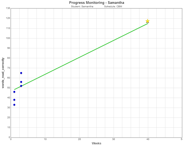
This report details the progress of a third grade female student named Samantha, who was identified as at-risk at the end of second grade. Much of the design of the Edutools.us system was conceptualized from working with data and situations from students like Samanatha. Samantha's data was not originally analyzed and visualized with Edutools.us. Because of logisitics and the instantaneous visualizations available with Edutools.us were not available, some decisions were delayed beyond what would be considered best practice. Edutools.us was created to ensure that teachers and diagnosticians have efficient, and effective methods for quickly visualizing data to make accurate and defensible decisions.
Samantha, female, at risk, grade 3. During Universal screening Samantha was identified as performing significantly below expectations. In order to demonstrate the consistency of the baseline data, all three initial data points are displayed on the graph. Samantha's case was already on the docket for problem-solving, though previous scores did not indicate the degree of discrepancy seen with universal screening. When the team reviewed Samantha's data it was determined that three additional data points should be collected. After collection of three additional points, data were graphed, and the plan for Samantha was put into place, including a challenging but attainable goal of 115 correct words per minute by the third benchmarking period. Specifically the goal for Samantha was written as In 40 weeks, given three benchmark probes from Aimsweb.com, a familiar diagnostician, and one minute to read each passage, Samantha will read 115 correct words per minute or greater on two of the three probes . The initial graph for Samantha is presented in Figure 1 above.
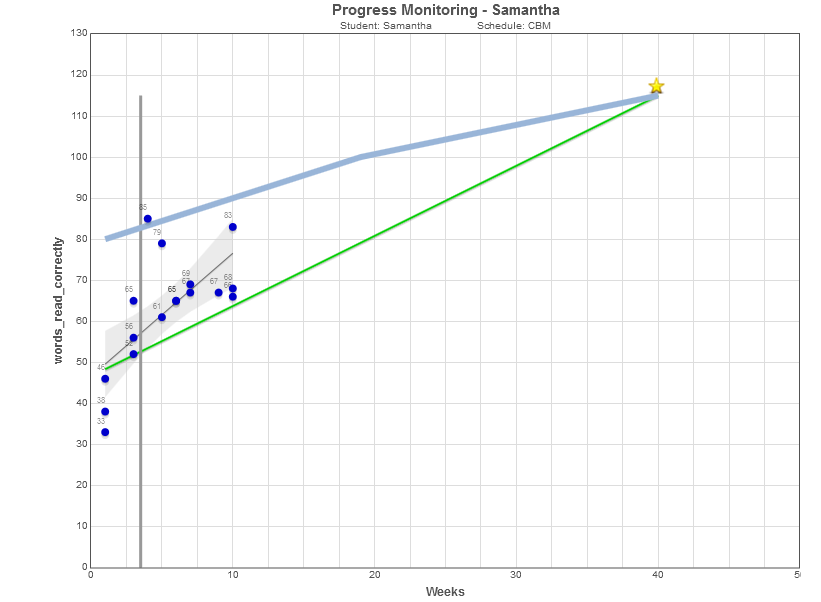
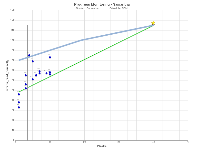
The plan for Samantha was put into place. Samantha would work with a small group for 30 minutes a day, using the Corrective Reading Decoding B1 series from SRA McGraw Hill. within a few weeks, Samantha's family brought in an advocate to argue that Samantha required special education services. The advocate argued that a different instructional program was preferable, and that Corrective Reading was not being implemented with fidelity, as the program requires 45 minutes. The graph in Figure 2 was presented to the parents and the advocate. During the discussion the parents began to question the ups and downs seen in the data, the concept for Edutools.us was born. What the parents were asking for was a confidence interval. Working with the data, in a variety of programs a graph similar to the one presented in Figure 3 was created. In figure 3, the data are presented with the raw data (blue dots), the aimline (green line ending at a star), the normative comparison (blue line), a trend line (grey line) and a 95 percent confidence band (grey filled section). When this graph was presented to the advocate, he reported to the parents that Samantha was in good hands, Although Samantha was still significantly behind her peers, the data showed that she was making strong progress, the concerns about the program were not warranted.
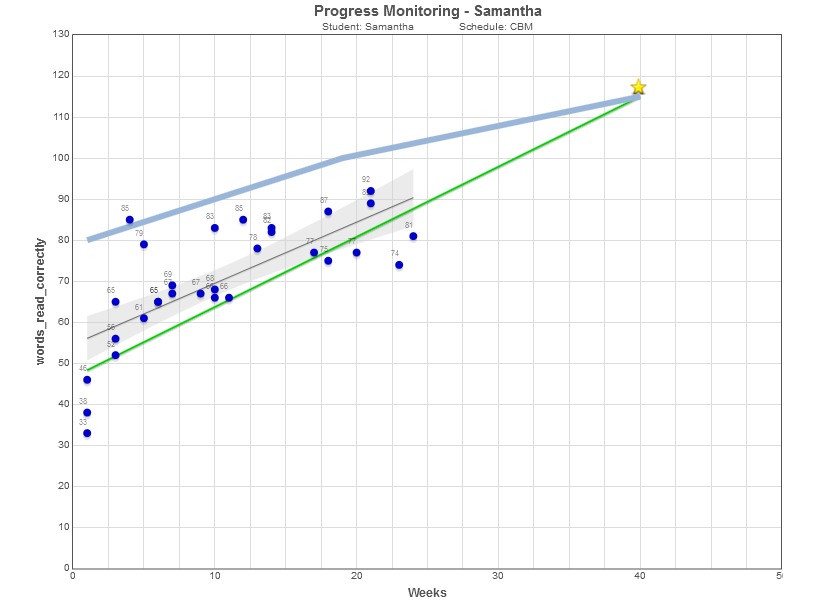
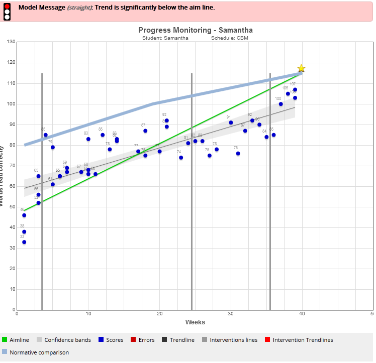
Everyone was confident that Samantha was on the right track. Data collection continued until Winter break, although progress continued to be made, results were not maintained at the same high level. A few individual data points fell below the aimline, but overall, progress was still adequate, the trend line remained above the aimline. Winter break came and went. Data after winter break indicated a drop below expectations, but both the parents and the team were more consumed with getting the second semester up and running. It was not long before it was clear that the initial push seen with Samantha had faded too much. Data were beginning to indicate a substantial need for change. The regular progress monitoring system that was being used did not show confidence intervals, and although the trend had fallen below the aimline, the significance of the drop was not as obvious as it would have been had the confidence interval been drawn as it is in figure 5.
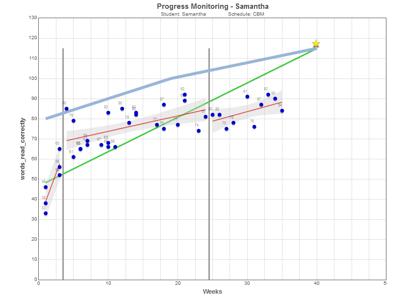
In figure 5, the results of the first intervention was still not significantly different from expected. The upper bound of the confidecne interval was still above the trend line. On the other hand, the data for the second trimester was clearly falling below the aimline Although it is not uncommon for the winter trend to be lower than that seen in the fall, clearly, the instructional program being delivered for Samantha needed an adjustment. The focus on reading that had been so strong in the early fall was all but gone. Had the data visualizations of Edutools.us been available to the team, chance dips and significant drops would have been distinguished. While logistics may not have changed, the intervention teacher would have had the early alert system provided by Edutools.us.
Unfortunately, Edutools.us was not available, so it was not until late February that the team was made aware of Samantha's data. Although no one wanted a repeat of the meetings that had occurred in the fall, because of State testing and subsequent Spring break, the meeting for Samantha was delayed a few weeks. The teacher worked hard to attempt to keep Samantha from falling further behind, but progress had flattend.
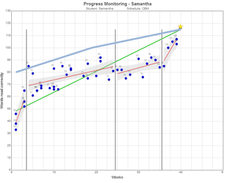
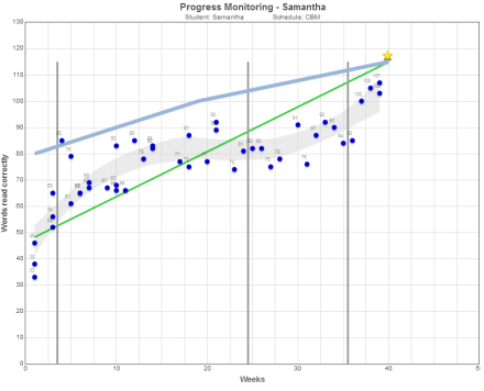
The team met, and determined that Samantha required an additional 15 minutes of Reading intervention three times per week. While much of the focus of the intervention was on oral reading, Samantha spent most of this time working one on one with her teacher, not only reading, but discussing authentic text taken from the guided reading she had been doing during her regular reading instructional period. The intervention reinvigorated the plan and the effects of the final push can be seen in the series of graphs presented below.
 |
 |
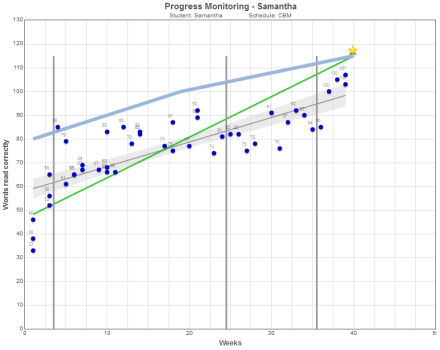 |
| Examination of trends for intervention period reveals the effects of the final push | A locally weighted regression follows the curvature of the pattern of data that follows the narrative | Ultimately, the intervention was not successful. Although substantial progress had been made, the flat period was allowed to continue too long |
The Full Analytics of the Edutools.us Report
The model message reports the status of an intervention plan. The model message reports the status of an intervention plan. The status of the intervention plan is rated along a continuum of significantly above expectations to significantly below. The familiar stoplight analogy is used to make interpretation more automatic.
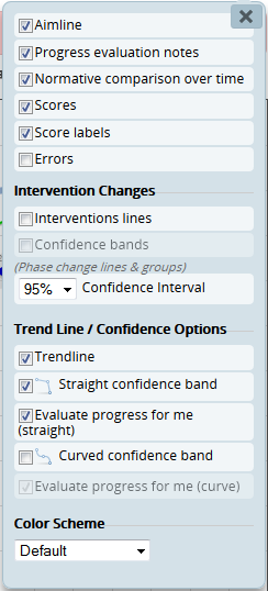
Graph options allow the end user to alter the items depicted on the graph to draw attention toward important factors in the interpretation of the graph.

An easy to read key is provided to indicate what is depicted on the graph. Basic and Advanced Analytics are provided to assist in the understanding and write up of results. The information provided include a Goal statement, a Growth statement, and overall evaluative statement, as well as several indicators of attainment relative to the goal. The percentage of the Goal Attained refers to the performance of the student relative to the goal at the time of initial measurement, and at the point of the Ordinary Least Squares Regression Best Fit line at the point of final assessment, when interventions are present this metric is also available at the terminal point of each intervention (fit/goal). The Percent of Normative Performance Attained refers to the performance of the student relative to the normative information entered into the assessment schedule.
The full EduTools.us report for Samantha is presented below
Goal
- Goal Statement: In 40 weeks, Samantha will obtain 115 Words read correctly
Growth
- Baseline Slope: The baseline slope was 9.33 Words read correctly per week
- Overall Slope: The overall slope was an increase of an estimated 1 Words read correctly per week
- Intervention Slope for Phase 1: Intervention slope for Phase 1 was an increase of an estimated 0.77 Words read correctly per week
- Intervention Slope for Phase 2: Intervention slope for Phase 2 was an increase of an estimated 0.95 Words read correctly per week
- Intervention Slope for Phase 3: Intervention slope for Phase 3 was an increase of an estimated 5.88 Words read correctly per week
Evaluation
- Recommendation (straight line):Trend is significantly below the aim line.
The Percent of the Goal Attained
- The Initial Performance to Goal Percent Attained is between 33% and 50%
- The Overall Best Estimate Percent Attained is 86%.
The Percent of Normative Performance Attained
- The Initial Normative Percent Attained is 48%.
- The Final Normative Percent Attained is 86%.
The Percent of the Goal Attained by the end of the (nth) Intervention
- The Intervention (1) Best Estimate Percent Attained is 50%
- The Intervention (2) Best Estimate Percent Attained is 74%
- The Intervention (3) Best Estimate Percent Attained is 77%
- The Intervention (4) Best Estimate Percent Attained is 93%
